
5 Tips for Financial Service Brochure Design
Financial services professionals, want to stand out without losing credibility? Explore five design tips that merge creativity with trust, featuring a case study from Attivare. Learn how to simplify complexity, build visual trust, and embrace digital design.
Amanda Falvo
In the world of financial services, trust is everything. But standing out while maintaining your credibility? That’s the sweet spot. Smart design can bridge the gap between financial expertise and creative innovation, helping you engage clients and explain complex concepts without overwhelming them.
Here are five design tips tailored for financial services professionals who want polished, practical, and powerful visuals:
5 Design Tips to Make Your Financial Services Shine Without Losing the Numbers
1. Keep It Clear, Not Cluttered
Let’s face it—financial concepts can be intricate. Your design shouldn’t be. Opt for layouts that prioritize readability: clean fonts, generous white space, and a logical flow of information. Think of it like a well-balanced portfolio—every element should serve a purpose.
Pro Tip: A strong call-to-action (CTA) at the end of your materials can guide clients toward that next important step—whether it’s a meeting, investment, or subscription.
2. Numbers Tell Stories Too—With Infographics
Pie charts, bar graphs, and timelines—when done right—are design power moves. Infographics help transform financial jargon and datasets into digestible, shareable content. Need to communicate risk-reward strategies or retirement savings projections? An infographic can simplify your story in a way that even the busiest CFO will appreciate.
3. Build Trust With Consistency
Clients in finance appreciate consistency—whether it’s in your investment strategies or your branding. Use the same color palette, typography, and logo placement across all your collateral. Think of it as the visual equivalent of a steady, reliable return on investment.
Pro Tip: Choose colors strategically. Blues and greens often evoke trust and growth, perfect for financial institutions.
4. Use Visuals That Feel Relatable
A stock photo of people in suits shaking hands? Snooze. Instead, opt for visuals that reflect your audience—entrepreneurs, families, retirees—living their financial goals. Authentic imagery humanises your brand and helps clients feel like you understand their unique journey.
5. Go Digital for Versatility and Reach
Digital brochures and interactive PDFs are game-changers in the financial world. Not only do they save on printing costs, but they also allow for real-time updates and seamless sharing. Responsive design ensures your content looks as sharp on a mobile screen as it does on a desktop.
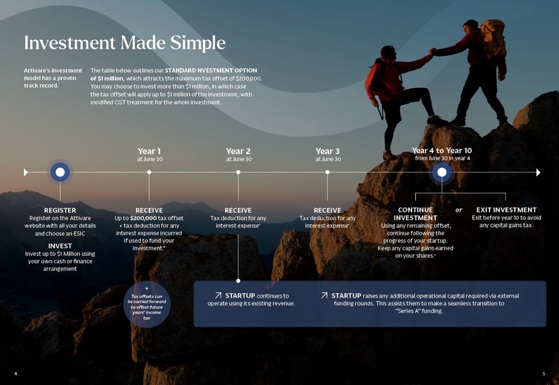
Case Study:
When Attivare—a financial services firm with a niche but complex product—needed to break down its offering, we created an infographic-based digital brochure. The result? A sleek, visually engaging tool that simplified their message without compromising its sophistication.
Within a month, their digital brochure had received 1,363 views. Compare that to traditional print brochures that often sit unopened on desks or get misplaced. The digital approach not only expanded reach but provided analytics to track engagement—a feature that print simply can’t offer.
Lesson learned: great design speaks volumes, even in a numbers-driven industry.
Click to view the brochure.
How Attivare Mastered Design with an Infographic
Let Design Work Harder for You
Financial services thrive on trust and clarity. By adopting thoughtful design principles, you can effectively communicate your value and stand out in a crowded market.
Ready to take the next step? Contact Spark Lane today. Let’s create visuals that speak your clients’ language—and yours too.
Closing thoughts…
Get in Touch
Contact Spark Lane Design today to discover how we can elevate your design and support your business growth.
Inquire
info@sparkdesign.com.au
Maribyrnong VIC 3032
Quick Links
Contact Info
Spark Lane Design
We acknowledge the Wurundjeri of the Kulin Nation, the traditional owners of the land we share. We pay respect to elders, past and present.